When there is an ample food supply, ideal conditions, and no limiting factors that would curb birth rates or cause premature death, a population is expected to grow quickly and at an accelerating rate. An easy way to understand this is to consider the fact that as the population grows, there will be more and more births and, at least initially, deaths won't affect the growth very much. If we examine a population over a longer time span, however, we would expect the growth rate to slow down. This may be due to limitations in food supply, the appearance of predators, diseases, or other factors. (You will learn more about population growth in Section 3.7.)
In this project, we will examine a few patterns of population growth, discuss rates, and look at some functions that can be used to describe the process.
-
-
Suppose a population of one hundred squirrels starts to grow in a large forest with unlimited food supply and no predators. Using the horizontal axis to represent time t in months and the vertical axis to represent the number of squirrels in the population, sketch by hand a possible graph depicting the population growth during the first few months. Explain your choice, mentioning rate of change, and how it changes over time. (Answers will vary.)
-
Use a graphing utility to find and display the graph of a function that approximates your sketch from part a. reasonably well. What type of function did you use and why? (Hint: Pay attention to the scaling of the axes. You may want to review the common functions and function transformations from Sections 1.2 and 1.3. Answers will vary.)
-
-
-
Now assume that the growth of the population in Question 1 starts slowing significantly after the first year. Sketch by hand a possible graph of the population growth over the first two years. Compare and contrast this new graph with the graph you sketched in Question 1a and explain any similarities and differences.
-
* Like you did above in Question 1b, utilize a graphing utility to find a formula for a function that closely approximates your sketch for Question 2a.
-
-
Write a short paragraph to argue why it is unrealistic to model the growth of a population using a curve that is increasing at an increasing rate on . Describe the kind of graph that you think would be the better choice.
-
-
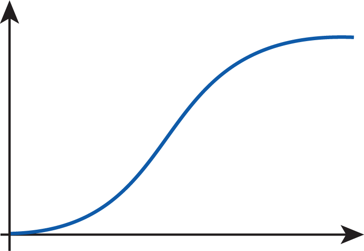
Hand sketch a possible curve depicting the growth of a squirrel population that has grown large enough to reach the limit of the amount of food that the environment is able to supply. How does the rate of change vary over time? Explain your reasoning.
-
How do you think the curve might change if it is to reflect the appearance of a growing predator population?
-
The first mathematician to introduce accurate models for population growth was Pierre François Verhulst (1804–1849). He introduced what he called logistic curves in a series of papers starting with "Note on the law of population growth," published in 1838. His work was based on studying the population growth patterns of several countries, including his native Belgium. In Question 5, you will be asked to examine such a logistic curve.
-
The function below describes the growth of a squirrel population in a large, forested area; time is measured in months, the number of squirrels in thousands.
-
Determine the limit of the function as . Describe in words the real-life meaning of the answer.
-
Use a graphing utility to sketch the graph of . How does its derivative change with time (i.e., as )?
-
-
The following table represents the approximate size of the US population between the years 1940 and 2020. Use the table to answer the questions below.
Approximate Size of the US Population in Millions Year 1940 1950 1960 1970 1980 1990 2000 2010 2020 Population (in millions) -
Find the average annual rate of change of the population of the US between 1950 and 2000.
-
Estimate the annual rate of change of the US population in the year 1950. (Hint: Consider the population before and after 1950.)
-
Estimate the annual rate of change of the US population in the year 2000. (See the hint given in part b.)
-
Compare the answers you obtained in parts a.–c. What can you infer from this? How does the rate seem to change over time?
-
Using the population data from the table, hand sketch a possible graph depicting the population change between 1940 and 2020. How is your answer to part d. reflected in the graph?
-
Based on your answers above, what are your predictions for the short-term and long-term future?
-