The Performance of the S&P 500 Companies During
the Covid-19 Pandemic
An article published by the Wall Street Journal in August of 2021 summarized the effects
of Covid-19 on the performance of the S&P 500 companies. More than three-fourths of the
companies reported higher revenues than pre-pandemic levels. Of those reporting higher
levels of revenue, reported revenues in the second quarter of 2021 above 2019 levels
after undergoing a drop in revenues in 2020. Of the remaining companies that had higher
revenues, revenues in the second quarter for the past two years exceeded 2019 levels. There
were companies in the S&P 500 that had revenues below 2019 levels and ten companies
experienced a drop in revenue in 2021 after having a rise in income in 2020.
The revenue figures are based on FactSet data for the S&P companies that reported their
revenue for the second quarter of 2021. Approximately one-third of the S&P 500 have seen
steady or rapid growth throughout the pandemic. The companies that have fared the best
are the pharmaceutical, retail, and semiconductor companies. Moderna Inc. experienced the
largest increase in revenue of all the S&P companies. Moderna's revenue increased
from the second quarter of 2019 to the second quarter of 2021, a value too large to include
in the figure below. The consumer services sector experienced the largest decline in second
quarter 2021 revenues, largely due to companies related to travel and tourism.
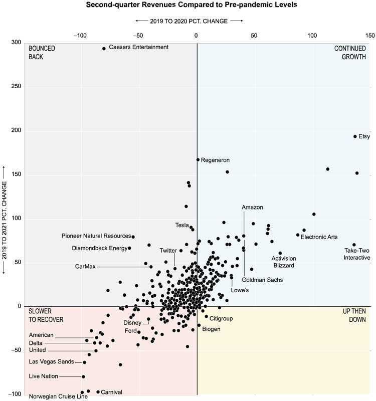
A dot plot, where each dot represents a company, is divided into four quadrants. The vertical axis is labeled "2019 to 2021 PCT. Change" and ranges from
to in unit intervals. The horizontal axis is labeled "2019 to 2020 PCT. Change" and ranges from to in unit intervals.
The four quadrants are marked with the following labels. The top-right quadrant is labeled "continued growth". In ascending order the titled data points are for the companies Lowe's, Goldman Sachs, Amazon, Activision Blizzard, Electronic Arts, Take-Two Interactive, and Etsy.
The company Regeneron is on the axis between the first and second quadrant. The top-left quadrant is labeled "bounced back". In ascending order the titled data points are for the companies are CarMax, Diamondback Energy, Pioneer Natural Resources, Twitter, Tesla, and Caesars Entertainment. Ceasars Entertainment is a clear outlier and at the point of approximately percent change from 2019 to 2020 and at percent change from 2019 to 2021.
the bottom-left quadrant is labeled "slower to recover". The titled data points are for the companies are Norwegian Cruise Line, Carnival, American Delta United, Las Vegas Sands, Live Nation, Disney, and Ford.
the bottom-right quadrant is labeled "up then down". In ascending order the titled data points are for the companies are Biogen, and Citigroup. Citigroup is the labeled point closest to the origin.
Overall the dots increase from left to right across the graph in a linear manner. The majority of the dots are clustered near the origin.
Note: Moderna is excluded. Its second quarter revenue percentage change since 2019 was in 2020 and in 2021.
Source: FactSet
Based on the article summary and the figure, answer the following questions.
What is the population of interest?
What is/are the variable(s) of interest?
Which company experienced the largest percentage change from 2019 to 2021?
Based on the figure, which company experienced the largest percentage change from
2019 to 2021? Can you think of an explanation of why this is the case?
Based on the figure, which company experienced the smallest percentage change
from 2019 to 2021? Can you think of an explanation of why this is the case?
Based on the figure, which company did a major recovery from 2020 to 2021 based
on revenues? Do some research on the internet to find out what caused the company
to make such a major recovery.
Chapter 2 Discovery Project
Bachelor's Degrees Conferred by Race/Ethnicity
Review the following graph using data from IPEDS (Integrated Postsecondary Education
Data) collected from Fall 2000 through Fall 2016 and answer the questions below.
Bachelor's Degrees Conferred by Postsecondary Institutions, by Race/
Ethnicity of Student Selected Years: 2000 through 2016
Year
White
Black
Hispanic
Asian/Pacific Islander
American Indian/Alaskan Native
2000
2001
2002
2003
2004
2005
2006
2007
2008
2009
2010
2011
2012
2013
2014
2015
2016
Source: U.S. Department of Education, National Center for Education Statistics, Higher Education General Information
Survey (HEGIS), "Degrees and Other Formal Awards Conferred" surveys, 1976-77 and 1980-81; Integrated
Postsecondary Education Data System (IPEDS), "Completions Survey" (IPEDS-C:90-99); and IPEDS Fall 2000 through
Fall 2016, Completions component. (This table was prepared August 2017).
A line graph of the data found in the table is titled "Bachelor's Degrees Conferred by Postsecondary Institutions, by Race/Ethnicity of Student, Selected Years: 2000 through 2016". The vertical axis is labeled "Number of Bachelor's Degrees" and ranges from to in increments of . The horizontal axis is labeled in years and ranges from 2000 to 2016 in increments of 1 year. There are lines plotted on the same graph for each category: White, Black, Hispanic, Asian/Pacific Islander, and American Indian/Alaskan Native.
the general appearance of the lines is as follows:
The line for White starts at approximately in year 2000 and decreases slightly to approximately year 2001. from years 2001 to 2013 the line increases steadily to approximately . from years 2013 to 2016 the line decreases gradually to approximately .
The line for Black starts at approximately and gradually increases over the course of the graph ending at approximately at year 2016.
The line for Hispanic starts at approximately and gradually increases over the course of the graph ending at approximately at year 2016.
The line for Asian/Pacific Islander starts at approximately and gradually increases over the course of the graph ending at approximately at year 2016.
The line for American Indian/Alaskan Native starts at approximately and gradually increases until year 2010 at approximately . from years 2010 to 2016 the line gradually decreases to approximately .
Are the data displayed in the graph above discrete or continuous?
What is the level of measurement of the data?
Are the data above time series or cross-sectional data?
Examine the data for each race/ethnicity group. Do the data represent a stationary or
nonstationary process? Explain your reasoning for each.
Do any of the race/ethnicity groups exhibit a decreasing trend? Try to think of some
reasons why this is true.
Do any of the race/ethnicity groups show a strictly increasing trend over the entire
time period from 2000 to 2016?
Chapter 3 Discovery Project
Your manager asked you to look at your company performance verses other similar
companies in your field. You feel that your company has had a successful year. To show
this you decide to compare your company's performance with other successful companies.
Choose a company that is traded on the United States New York Stock Exchange. This stock
will then be considered "your company" for this project. The stock that your company will
be compared against is the S&P 500 Information Technology Index or S&P 500 for short.
Download Data
Download, copy and paste or transcribe the stock data for your company and
S&P 500 for the prior year. For example, if it is 2021 then download
to stock performance. Hint: use the internet and search how to
download stock data.
When downloading your year of data, use the frequency of one week or one
data point per week for approximately 52 data points.
Only use the Close of market (Close for short) data for this project.
Plotting Time Domain Data
Create separate plots for your company's stock and the S&P 500 for the year.
Remember to label the figure and don't forget to include units such as dollars
for the y-axis (two graphs).
Create a time series plot including both companies' stocks (one graph).
Hypothetical Investment
The stock prices of your company and the S&P 500 may vary greatly. To
avoid this problem, you decide to make a hypothetical investment of
at the first of the year. Before doing that, normalize your data by dividing
each value by the largest value in your dataset. All your values should be less
than or equal to . Repeat Part 2 steps A and B plots using the hypothetical
investment data (three graphs).
Compare and contrast the plots from Parts 2 and 3.
Report Findings to the Manager
After looking at the performance of your company and the S&P 500 write a 1–2
paragraph summary of your findings such as what was learned from the different plots,
or how they stocks performed during different time frames. Include other suggestions
to further benchmark performance.
Chapter 4 Discovery Project
Describing Real Estate Data
Answer the following questions regarding the realty data gathered on the selling prices and
commissions of properties sold by JDC Realty in Southwest Virginia.
Use the JDC Realty Property Sales Prices data set. This data set contains information about
properties sold between January 2020 and November 2020.
Note that the gross commission paid is equal to the commission percentage multiplied by
the sales price. Also note that the amount paid to the agent, the amount paid for referrals,
agent liability costs, and the net office amount add up to the gross commission paid.
Create a histogram of the property sales prices. Do the data appear symmetric or
skewed? Are there any outliers?
Calculate the following measures of location for sales prices and compare them:
mean, median, 10% trimmed mean. Which of these measures do you think gives us
the best estimate of the center of the data and why?
Calculate the variance and standard deviation of sales prices.
Use Chebyshev's Theorem to find the range of values in which at least of the
sales price data will reside.
Calculate the five summary measures needed to construct a boxplot of sales prices
and create the boxplot.
Calculate the interquartile range for sales prices and use this value to identify any
potential outliers.
Create a scatterplot of Pay Agents vs. Sales Price.
Calculate the correlation coefficient between Pay Agents and Sales Price. Describe
the relationship indicated by the scatterplot and the correlation coefficient. Can you
think of any factors that might affect the value of the correlation coefficient?
Subset the data to only include the observations that have nonzero values for Pay
Agents. Create a new scatterplot and calculate the correlation coefficient for the
subsetted data. Describe your results.
Chapter 5 Discovery Project
The cost of higher education at both public and private institutions is increasing and
adversely affecting college students. Utilizing an institutional dataset called Financial
Survey of Students 2006 compiled at one of the largest public universities in the southwestern
United States, this study examined financial satisfaction among an undergraduate student
population. Understanding the financial satisfaction of college students can help improve
the efforts of university administrators and educators. The data used come from an online
survey that was conducted at a large public university in the southwestern United States.
The data were created and administered by the Institutional Research and Informational
Management (IRIM) department, in conjunction with the Office of Financial Aid and the
Office of the Provost, to examine college students' financial characteristics. All enrolled
students ( students) were invited to participate via a mass email, and a link to the
online survey was included after a disclaimer and description of the research project. As a
participation incentive, the email included a drawing for two scholarships. A total of
usable responses were received, yielding a response rate of roughly . Of those,
were college students. The sample was further limited to those who responded to the
financial satisfaction question "How satisfied are you with your financial situation right
now?" The possible responses were satisfied, neutral or dissatisfied. After removing neutral
responses from the sample, the final sample was responses.
Characteristics
n
Satisfied
Dissatisfied
Student Loan
No Student Loan
Student Loan
Student Credit Card Debt
No credit card debt
Credit card debt
Student Credit Card Amount
0
1-500
501-1000
1001-2000
>2000
Missing
Source: "The relationship of student loan and card debt on financial satisfaction of college students," Solis, O. and
Ferguson, R., College Student Journal, Volume 51, Number 3, Fall 2017, pp. 329-336(8).
Using the tables above, answer the following questions (give percentages accurate to one
decimal place):
What percentage of college students who had student loans were dissatisfied with
their financial situation?
What percentage of college students who had credit card debt were dissatisfied with
their financial situation?
What percentage of college students who had credit card debt above $1000 were
dissatisfied with their financial situation? (First calculate how many such students
there are and round it to the nearest whole number, then find the percentage.)
What percentage of college students are satisfied with their financial situation? (First
calculate how many such students there are and round it to the nearest whole number,
then find the percentage.)
What percentage of college students are dissatisfied with their financial situation?
(First calculate how many such students there are and round it to the nearest whole
number, then find the percentage.)
If a student is selected at random from this particular college, what is the likelihood
that the student was included in the final sample?
Given what you know about the data and its collection, what are some limitations
of this study?
Chapter 6 Discovery Project
Take Me Out to the Ball Game!
Use the Moneyball data set which contains selected statistics for Major League Baseball
teams from 1962–2012.
Select the variable Number of wins, W, and compare the distribution of W for the
American League (AL) with that of the National League (NL). Use side-by-side
boxplots as described in Chapter 4.
Identify the outliers in both leagues (i.e., the teams that have a total number of wins
far from the rest of the teams in their league).
Compare the distribution of the Number of wins, W, for NYM and TEX using a side-by-side boxplot and by investigating the numerical summaries of each. (Compare
the shapes, means, medians, and the variability.)
Discuss why the discrepancy in variability between the performance of NYM and the
performance of TEX didn't cause a similar discrepancy in their respective leagues.
Based on historical data, the probability that in a given year the NYM will make the
playoffs is . Let X be the discrete random variable that gives the
total number of Playoffs made by NYM in the last years, i.e., from 1993 to 2012.
Assume that the outcomes for the NYM in these years are unknown for
us. Also assume that the outcome in any of the years is independent of the
outcome in any other year. Under these assumptions, what would be the
distribution of X? Why?
What is the probability that the total number of playoffs made by NYM
during this 20-year period is exactly three?
What is the probability that the total number of playoffs made by NYM is
at most ?
What is the probability that the total number of playoffs made by NYM is
at most ?
What is the probability that the total number of playoffs made by NYM is
at least ?
What is the expected number of playoffs that NYM will make in this 20-
year period?
Find the variance of the number of playoffs that NYM is expected to make
in this 20–year period?
Can we use the Poisson distribution with to model the number of
playoffs that NYM will make? Why?
At the beginning of this chapter, we discussed the methodology of how automobile tire
manufacturers determined the warranties associated with a particular tire that they made.
The data set named Tire Manufacturer Warranty contains a sample of tire mileages from
each of tire manufacturers. Using these data, please answer the following questions:
Determine the mean and standard deviation of the mileages for each of the tire
manufacturers.
Do the mileages for each of the tire manufacturers follow a normal distribution?
Justify your answer using graphical techniques.
In the event that the mileages for a tire manufacturer do not follow a normal
distribution, will that prevent us from calculating probabilities associated with the
average mileages? Justify your answer.
What is the distribution for each of the sample means of the mileages for each of the tire manufacturers.
Determine the warranty mileage for each manufacturer if they want no more than
of the tires to need replacement.
Answer question 5. if they want no more than of the tires to need replacement.
Chapter 8 Discovery Project
Industry Statistics
Pick an industry (software companies, computer manufacturers, oil, etc.) and research the
financial information about companies in that industry. The internet, your library, and the
prospectus from each of the companies may be useful resources to help you with your research.
Also, select a statistic to track or follow about the companies such as sales, profit, revenue, etc.
Using the information that you gather about the companies, answer the following questions.
Identify the population of interest.
Select a random sample of 10 companies in the industry that you've selected and
record at least three variables of interest for each of the companies.
Compute the average and standard deviation of each variable of interest.
Compute the standard error of each variable of interest.
Discuss what you have learned about the statistics you studied and the companies
in your population.
Identify the sources used for this project.
Chapter 9 Discovery Project
Home Sweet Home: Using Confidence Intervals to
Analyze and Compare Home Prices
One of the biggest purchases we make in our lives is a home. As we buy a home we ask
ourselves many questions such as:
How much should I spend for a home?
How many bathrooms are there?
What is the cost per square foot?
Suppose you are looking for a house near Charleston in Mount Pleasant, SC, and you have
narrowed your search to three subdivisions: Carolina Park, Dunes West, and Park West.
Download the Mount Pleasant Real Estate data set.
Import the data into Minitab, Excel or other statistical software.
For the variable List Price, calculate the sample mean, the sample standard deviation,
and the sample size for the three different subdivisions. Put the calculations in a table
and round to the nearest dollar for the sample standard deviation and the mean.
Based on the data set and the information we have, which confidence interval should
we use here, a z or a t interval? Why?
Find the critical value for a confidence level for each subdivision for the variable List Price.
Construct an interval to estimate the true average List Price for each subdivision with
confidence. Based on these confidence intervals, is it possible that Carolina Park
and Dunes West have the same average List Price. Discuss.
Do you think a List Price of is a reasonable value for the Carolina Park
subdivision?
Do you think a List Price of is a reasonable value for the Dunes West
subdivision?
Do you think a List Price of is a reasonable value for both the Carolina
Park and Park West subdivisions?
Chapter 10 Discovery Project
Wearables in the Sports Industry?
Apolo, a startup which manufactures smart devices, recorded responses from athletes,
trainers, coaches, and team physicians regarding their interest in wearing Apolo smart devices
and their beliefs on whether wearables improve their performance. These responses are recorded
in the Wearables in the Sports Industry data set. As discussed at the beginning of this chapter,
the use of wearables is a multibillion-dollar industry worldwide for companies such as Apple,
Fitbit, and other organizations that produce wearable technology to track fitness and nutrition.
Do you use Apolo smart devices to train?
Do you feel that Apolo smart devices have helped you improve your performance?
Would you recommend the use of Apolo smart devices to train?
The responses to these questions were recorded as (No) or (Yes). If the answer to
question was yes, then a fourth question was asked:
How many hours per week do you use Apolo smart devices to train?
If the participant did not use Apolo smart devices, then was recorded for the hours.
Using the aforementioned data, please do the following:
Summarize the data by role indicating the number of coaches, team physicians,
athletes, and trainers that chose to participate in the survey.
Summarize the data according to the role of the participants and the first three
questions asked of them. That is, create a table indicating the number of people in
each role who answered "Yes" to each of the first three questions.
Apolo believes that they will be profitable if more than of survey respondents
use smart devices. Test that Apolo will be profitable using a significance level of .
Some managers at Apolo believe that the responses of the athletes are the only ones
that matter. Find the P-value for the hypothesis test that at least of the athletes
would use Apolo smart devices. Do the data suggest that more than of the athletes
will use Apolo smart devices at a level of significance?
For Apolo customers (i.e., the survey participants who answered "Yes" to "Do you
use Apolo smart devices to train?"), calculate the sample mean and sample standard
deviation for the number of hours that they use an Apolo smart device per week.
Apolo believes that in order to retain customers, the customers need to be using smart
devices more than hours per week. Test the hypothesis that, on average, Apolo
customers use their smart device more than hours per week. Use a significance
level of .
Apolo would like to know a probable range of values for the mean hours customers
use a smart device per week. Construct a confidence interval for the mean
hours Apolo customers use a smart device per week. What can Apolo conclude
about the mean?
Sample of the Data Collected
Gender
Age
Role
Do you use Apolo smart devices to train?
Apolo smart device improved performance?
Recommend use of Apolo smart device?
Male
Coach
Male
Team Physician
Female
Team Physician
Male
Team Physician
Female
Athlete
Male
Team Physician
Female
Trainer
Female
Athlete
Chapter 11 Discovery Project
Understanding Credit Scores
There are many factors that determine one's eligibility to obtain credit. Several factors are
considered such as education level and credit scores. An individual's credit score is a good
predictor of one's ability to manage their finances and pay their debts responsibly. See
Credit Score: Definition, Factors, & Improving It (investopedia.com) for more information
on understanding credit scores. Credit scores are used to determine your eligibility for
credit cards, car loans, and even for some types of insurance. Often when an individual has
a lower credit score, they will have higher interest rates and lower borrowing capacity for
loans and credit cards.
Suppose you are working in the marketing department for a large credit card company. Your
company is launching a new credit card and will be mailing information to prospective
customers. You are examining information from your current customers and are interested in
understanding the differences in credit scores among groups of customers. You are looking at
factors such as marital status, how many credit cards are used by the customer, and whether
they rent or own their home.
Using the Credit Card Data file, answer the following questions to better understand your
current customer base. The data set includes credit scores and data on nine () predictor
( data points).
Download the data file and open it in Microsoft Excel.
Determine the mean, mode, median, maximum, minimum, standard deviation, and the
coefficient of variation of the following variables: age, total credit limit, total balance,
credit score, annual household income, and number of children and briefly discuss the
results. (Hint: these values can be quickly calculated using the Data Analysis Add-in:
Descriptive Statistics in Excel.)
Fully summarize the qualitative variables (i.e., What percent of the sample has a
college degree) and briefly discuss your findings. (Hint: These values can be quickly
determined using the Data Analysis Add-in: Histogram in Excel.)
Determine if there is a difference in credit scores for those that are single () versus those that are married () using the appropriate
hypothesis test. Use a significance level of .
Is there a higher proportion of customers that own () their home as
opposed to renting ()? Conduct the appropriate hypothesis test using a
significance level of .
Determine if there is a difference greater than in the total balance on all credit
cards between those that have children versus those that do not have any children
using the appropriate hypothesis test. Use a significance level of .
Is there a difference in the proportion of customers that have some college () or a college degree () versus those that have a high
school diploma ()? Conduct the appropriate hypothesis test using
a significance level of .
Determine if customers under 40 have a fewer number of credit cards issued versus
those customers 40 or older using the appropriate hypothesis test. Use the
significance level.
Is there a difference in household income based on being married
()
or separated/divorced ()? Conduct the appropriate hypothesis test
using a significance level of .
Determine whether the variances of the total credit limit differ by housing status (/). Conduct the appropriate hypothesis test using the significance level.
Briefly summarize your findings from this data set to your manager.
Chapter 12 Discovery Project
Economists use several metrics to understand the state of the economy and what might lie
ahead. Some of those metrics specifically focus on consumer spending. One such measure
is consumer consumption. This value gives economists an idea of how much consumers are
spending and is tracked monthly, in order to understand how consumer spending impacts
the overall economy.
One way that consumers choose to pay for goods and services is through using credit cards.
Obtaining a credit card is generally simple and most consumers can qualify for some type of
card. The terms of the credit issued can vary though based on variables such as household
income, credit score, and educational status.
Using the data set Credit Card Data, answer the following questions to better understand
how differences in certain factors can impact spending and credit limits. The data set has
nine variables ( data points).
Download the data file and open it in Microsoft Excel.
Determine the mean, mode, median, maximum, minimum, standard deviation, and
the coefficient of variation of the following variables: age, total credit limit, total
balance, credit score, annual household income, and number of children and briefly
discuss the results. (Hint: These values can be quickly calculated using the Data
Analysis Add-in: Descriptive Statistics in Excel.)
Fully summarize the qualitative variables (i.e., what percent of the sample has a
college degree?) and briefly discuss your findings. (Hint: These values can be quickly
determined using the Data Analysis Add-in: Histogram in Excel.)
Determine if there is a significant difference in credit card balances based on
educational status using the appropriate hypothesis test. Use a significance level
of . If significant differences are found, determine which groups are different
from each other. (Note: It will be necessary to rearrange the dataset to conduct the
hypothesis test.)
Choose one of the other qualitative variables (i.e., housing status) and determine
if there is a significant difference in credit card limits based on that variable. Use
the significance level of . If significant differences are found, determine which
groups are different from each. (Note: It will be necessary to rearrange the dataset to
conduct the hypothesis test.)
Conduct the appropriate hypothesis test to see if there is a difference in credit card
limits by both marital status and housing status. Use the significance level of .
(Note: It will be necessary to rearrange the dataset to conduct the hypothesis test.)
Partition and sort the data for credit score based on the marital status and number of
children in the household. Randomly select data points where there are no kids in
the household, then do the same for those households with children, also include the
marital status. This data selection will be used in the next problem.
Conduct the appropriate hypothesis test to see if there is a difference in credit scores
by both marital status and number of children in the household. Use the significance
level of . Is there any interaction present between the variables? (Note: You will
use the data subset you selected in the previous problem. Be sure the data is formatted
appropriately for the selected hypothesis test.)
Briefly summarize your findings from these analyses and discuss the limitations
present in the data set.
Chapter 13 Discovery Project
Gas vs. Oil Prices
Managing expenses is often a critical job duty for Chief Financial Officers (CFOs). Sometimes
costs are fairly easy to forecast. Items such as office supplies and staffing costs are generally
more manageable costs to estimate for budgeting purposes. Other expenses such as raw
materials and utility costs can be harder to forecast because the prices can fluctuate widely
during a given time period.
Gasoline is another such expense. Gasoline prices are determined in part by the price per
barrel of crude oil. There are two predominate types of crude oil used in the industry to
determine the price of gas we see at the pump: West Texas Intermediate (WTI) and Brent
Blend. WTI is the benchmark used in the United States and Brent Blend is mostly used in
Europe and Africa. An interesting side note is that about gallons of gasoline are made
from one barrel of crude oil (Source: Frequently Asked Questions (FAQs) – U.S. Energy
Information Administration (EIA) .)
Industries that rely heavily on gasoline to provide their product or service can find it difficult
to estimate the gasoline expense from month to month and sometimes even from day to
day. Some examples of industries that have fluctuating gas price impacts are transportation,
landscaping, and logistics. Being able to reliably forecast the gasoline expense is a critical
component of estimating company profits.
Imagine you are tasked with determining reliable estimates of the price per gallon of gasoline
to be used in forecasting company profits. Using the data file called Gas Prices vs. Oil Prices,
answer the following questions to better understand the relationship between the two types
of crude oil and their impact on gasoline prices. The data set includes monthly gasoline and
crude oil prices between January 2000 and March 2021 ( data points).
Download the data file and open it in Microsoft Excel.
Determine the mean, mode, median, maximum, minimum, range, standard deviation,
and the coefficient of variation of the price per gallon (to decimal places) and briefly
discuss the results. (Hint: These values can be quickly calculated using the Data
Analysis Add-in: Descriptive Statistics in Excel).
Create scatterplots of each of the crude oils against the price per gallon.
Fit a simple linear regression (SLR) model for Brent Blend vs. Reg Gas Price per
Gallon and WTI vs. Reg Gas Price per Gallon.
Obtain the residuals for each regression analysis and plot them.
Validate the assumptions — of linearity, independence, normality, constant variance.
Test the slopes for each crude oil model to see if they are statistically significant.
Obtain confidence intervals for the slopes using a significance level.
Make some predictions. Pick a price per gallon (or barrel) for Brent Blend and WTI
and predict the price of a regular gallon of gas.
Which crude oil would you recommend as the best predictor of regular gasoline prices
for your company to use to forecast expenses?
Chapter 14 Discovery Project
Home Sweet Home: Using Multiple Regression to
Analyze and Predict Home Prices
An important problem in real estate is determining how to price homes to be sold. There
are so many factors—size, age, and style of the home; number of bedrooms and bathrooms;
size of the lot; and so on—which makes setting a price a challenging task. In this project,
we will try to help realtors in this task by determining how different characteristics of homes
relate to home prices, identifying the key variables in pricing, and building multiple-variable
regression models to predict prices based on property characteristics.
Our analysis will be based on the Mount Pleasant Real Estate Data. This data set includes
information about properties for sale in three communities in the suburban town of
Mount Pleasant, South Carolina, in 2017.
Phase 1: Data Preparation
Download the Mount Pleasant Real Estate Data from stat.hawkeslearning.com and
open it with Microsoft Excel.
Determine the mean, mode, median, maximum, minimum, standard deviation, and
the coefficient of variation of the following variables: price, number of bedrooms,
number of bathrooms, number of stories, and square footage, and briefly discuss the
results. (Hint: these values can be quickly calculated using the Data Analysis Add-in:
Descriptive Statistics in Excel.)
Fully summarize the qualitative variables (i.e., What percent of the sample has a
pool?) and briefly discuss your findings.
To ensure the data contain comparable properties, eliminate duplexes and properties
whose prices are outliers. What limitations does this impose on our analysis? How
did you determine which prices were outliers?
Consider the following variables associated with each property:
For the qualitative variables, adjust this data in a reasonable, quantitative way for
use in a regression analysis.
Use the following correlation matrix and describe any issues with multicollinearity.
A
B
C
D
E
F
G
H
I
J
K
L
M
N
O
P
Q
1
Bedrooms
Baths - Total
Baths - Full
Baths - Half
Stories
Subdivision
Square Footage
Age
Acreage
New Owned?
House Style
Covered Parking Spots
Fenced Yard
Screened Porch?
Golf Course?
Fireplace?
2
Bedrooms
1
3
Baths - Total
0.70
1.00
4
Baths - Full
0.67
0.95
1.00
5
Baths - Half
0.06
0.13
-0.18
1.00
6
Stories
0.43
0.50
0.42
0.24
1.00
7
Subdivision
0.08
-0.05
-0.04
-0.01
0.06
1.00
8
Square Footage
0.71
0.74
0.68
0.19
0.44
0.11
1.00
9
Age
0.05
-0.07
-0.12
0.14
-0.07
0.28
0.18
1.00
10
Acreage
0.12
0.19
0.16
0.11
0.00
-0.03
0.35
0.33
1.00
11
New Owned?
-0.14
0.00
0.01
-0.05
0.04
-0.29
-0.22
-0.78
-0.15
1.00
12
House Style
-0.22
-0.22
-0.22
0.03
-0.15
0.07
-0.22
-0.06
-0.12
0.11
1.00
13
Covered Parking Spots
0.28
0.35
0.31
0.13
0.16
0.03
0.47
0.14
0.24
-0.15
0.07
1.00
14
Fenced Yard
0.04
-0.12
-0.13
0.04
-0.11
0.01
-0.03
0.29
-0.10
-0.41
-0.01
-0.04
1.00
15
Screened Porch
0.17
0.24
0.23
0.02
0.14
-0.25
0.14
-0.04
0.03
-0.05
-0.18
-0.03
0.12
1.00
16
Golf Course?
0.30
0.26
0.27
-0.02
0.19
-0.14
0.37
0.34
0.48
-0.19
-0.08
0.23
0.12
0.13
1.00
17
Fireplace?
0.18
0.18
0.20
-0.08
0.06
0.04
0.22
0.14
0.09
-0.13
-0.17
0.05
0.11
0.30
0.22
1.00
18
Number of Fireplaces
0.16
0.21
0.22
-0.03
0.04
0.11
0.35
0.24
0.14
-0.20
-0.13
0.15
0.13
0.28
0.17
0.80
Phase 2: Constructing Predictive Models
Construct the multiple regression model with input variables ,,, and .
Examine the impact of adding additional variables to the model.
Add to the model. Is the addition of to the model significant? How was the adjusted
impacted? What is the P-value for ?
Add to the model. Is the addition of
to the model significant? How was the adjusted
impacted? What is the P-value for ?
Add to the model. Is the addition of
to the model significant? How was the adjusted
impacted? What is the P-value for ?
Add to the model. Is the addition of
to the model significant? How was the adjusted
impacted? What is the P-value for ?
Perform a hypothesis test to determine if the model is useful for predicting home
values at a significance level of . State the P-value and interpret its meaning.
Are any variables not useful predictors of home price at a significance level of ?
State the P-values of these variables. Intuitively, what does this mean with respect to
pricing properties?
State the best model for the data and justify your answer.
Phase 3: Applying and Interpreting the Model
Suppose you own a square foot -story house in one of the communities in the
data set with bedrooms, baths, a pool, and it is located on a golf course, but has no dock or fenced yard. What does the model predict the price of your house to be?
A common term in real estate is "comparables," or "comps" for short, which are
properties that have similar characteristics. It is common for realtors to look up
"comps" for a certain property to get an idea of how to price it. Locate the "comps"
for your home in the data set. Create a box plot of the "comps" and estimate a price
range for your house on this basis.
What advantages and disadvantages does this approach have to the multiple regression
model above?
Chapter 15 Discovery Project
The Global Financial Crisis of 2007 – 2008
The global financial crisis of 2007 – 2008 seemed to have been years in the making. By the
summer of 2007, financial markets around the world were showing signs that a correction was
overdue for several years due to companies (primarily financial institutions) taking advantage of
"cheap credit." Several large banks were the first to collapse and investors were being warned
that they might not be able to withdraw their money from stock market accounts, retirement
funds, or even regular bank accounts. This was a stark reminder of the Great Depression between
1929 – 1932. Even with these warnings, investors did not anticipate the worst financial crisis in
nearly 80 years was about to cripple the global financial system. The financial crisis cost many
ordinary people their jobs, their life savings, their homes, and for some, all three were lost.
This global financial crisis will be written about for many, many years to come with many
financial experts asking, Should we have seen this coming? To shed just a little light on the
crisis and to help answer the question, please use the data titled "Percentage Change in Real
Home Price Index since 1890" to answer to answer the following questions.
Plot the raw data (Percentage Change in Home Price Index (HPI) against Date) from
January 1, 1970, through December 1, 2008. Do you see any patterns over the first
five years; over the first 15 years; over the first 30 years?
Are these data stationary or nonstationary?
Do you see any patterns of variation in the data such as trends, cycles, or seasonality?
If so, please identify the timeframe and whether these patterns might have been helpful
in predicting the crisis (as a function of HPI).
Using MS Excel, perform a -period moving average to predict HPI. Using these
predictions, did you see any evidence that would help you predict the global financial
crisis? Is the moving average method good for predicting HPI for this data? Please
justify your answer.
Using MS Excel, using the adjusted exponential smoothing procedure to predict the
HPI for January 1, 2009. Using and . Using these predictions, did
you see any evidence that would help you predict the global financial crisis? Is this
forecasting method good for predicting HPI for this data? Please justify your answer.
Would the Additive Seasonal Forecasting method be good to use for this data? Please
justify your answer.
There are many more questions that could be asked. Please take the time to explore all of the
data to find as many "stories" as possible. One can also examine productivity growth and the
labor force growth, labor force participation rates, average household incomes, aggregate
household debt, just to name a few. This is just one of many sets of data associated with the
Global Financial Crisis of 2007 – 2008.
Chapter 16 Discovery Project
Individual Stocks vs. Index-Matching Investments
In stock market investing, the traditional approach is to buy and sell stocks for individual
companies, but this is sometimes risky as it is very difficult to predict when large changes
to prices may occur. Large upswings or downswings in stock prices may happen for many
reasons. Some positive examples leading to large stock price increases include the following.
Retail sales on Amazon have frequently exceeded expectations.1
Apple introduced its wildly popular iPhone, and continued to introduce new versions.2
Netflix exploded in popularity; a growth of million subscribers in the first
quarter of 2018 (up from the expected million) led to a stock increase of
in that quarter.3
Line graph of the Amazon Closing Stock Price from January 3rd of year 2000 to January 3rd of year 2021. The horizontal axis is labeled in years in increments of 1 year. The vertical axis is labeled Stock Price ($) and ranges from to in increments of . From January 3rd, 2000 to January 3rd, 2015 the line grows slowly and remains below a stock price of . From January 3rd, 2016 to January 3rd, 2021 the line graph shows significant, rapid growth and ends at an approximate stock price of .
Some negative events leading to plummeting stock prices include the following.
Microsoft lost a federal antitrust lawsuit in 1999 and its stock price dropped in
a single day.4
In 2015, the Environmental Protection Agency (EPA) discovered Volkswagen had
intentionally programmed certain diesel engines to activate emission controls for
certain nitrous oxides only during testing, which made it appear as though the vehicles
released less than the legal limit of the polluting gases, but the vehicles actually released
times the legal limit! In the wake of the scandal, Volkswagen stock prices dropped
from to in just three days.5
As we see, certain events may cause large fluctuations in stock prices, which may be good or
bad for the investor, but in either case, it results in a volatile and sometimes risky investment.
Index-matching funds are portfolios (groups of multiple stocks) structured so that they match
a market index, such as the Standard & Poor's 500 Index (S&P 500).6
Gains or losses to the
investment will be (proportionally) the same as that of the whole S&P 500. Such an index
tends to be less volatile than investing in individual stocks, therefore index-matching funds
are considered less risky investments. These funds are often used as parts of retirement funds
or other long-term investments. But, how true is this assumption? Is an S&P 500 index-matching fund actually a safer investment? Our goal for this project is to test that assumption.
Daily closing stock prices can be found on the website https://www.macrotrends.net/stocks/stock-screener. The closing price data for three stocks (Amazon (AMZN), Starbucks (SBUX), and
Coca-Cola (KO)), along with the S&P 500 index fund (SPY) from the beginning of
2000 to the end of 2017, can be found on our website.
We want to determine how the value of certain stocks and the S&P 500 compare over
time, so notice that a new column called Price Change was created measuring the
daily change in stock price for each stock, i.e.,
etc.
It does not make sense to simply compare stock prices of the different stocks because
the prices are on very different scales. For example, if a stock drops by , it
is less consequential than if a stock drops by . A reasonable adjustment is to
consider a price change as a percentage of the previous day's price, so the example
above would be a drop compared to a drop, which allows us to do a more
reasonable comparison. A new column for each stock and the S&P 500 index has
been created with these percentages and is labeled as Return.
Can you think of any descriptive statistics that would compare the volatility of the returns?
Create box plots of the returns for each stock and the S&P 500 index.
Do you notice any patterns in the box plots that suggest a difference in the stocks and
the S&P 500 index? Explain their practical significance, if any.
Delete the outliers in the data for each stock and the S&P 500 index and create
histograms for each on the same scale. [Hint. Excel's Data ToolPak add-in allows
for easy histograms where we can specify the bins.]
Are any differences between the stocks and the S&P 500 index apparent from the
histograms? Explain their practical significance, if any.
Use a test for goodness of fit to test whether the distributions of the non-outlying
stock returns and index returns are different (at least over the range of the S&P 500
returns) at a significance level of .
Home Sweet Home: Using Nonparametric Tests to
Compare Home Prices
Use the Mount Pleasant Real Estate data which contains information about properties for
sale in three subdivisons of Mount Pleasant, South Carolina in the year 2017.
Download the Mount Pleasant Real Estate data into a statistical software package
like Excel or Minitab.
Classify the three variables List Price, Square Footage, and Subdivision as qualitative or
quantatitive and provide the level of measurement (nominal, ordinal, interval, or ratio).
Which of the quantitative variable(s) should be considered as the dependent variable?
Why?
Use statistical software to make a histogram for List Price and describe the distribution.
Can we use the t-test to see if the mean home price is significantly more than ?
Justify your answer.
Assuming that the underlying distribution is not normal, we have an opportunity to
use nonparametric methods to analyze the data. Can we conclude that the median
List Price in Mount Pleasant in 2017 is significantly more than half a million dollars?
State your hypotheses and perform a sign test using .
Create side-by-side boxplots of List Price for the three Mount Pleasant subdivisions:
Carolina Park, Dunes West, and Park West. Describe the distributions of the three
subdivisions and comment about their variability.
Use the Wilcoxon rank-sum test to see if the distribution of List Price in Park West
in 2017 is to the left of that in Dunes West.
Chapter 18 Discovery Project
Using Statistical Process Control to Improve Air
Traffic Processes
Choose two cities of interest and research/report actual flight times over a particular
weekend, Friday through Sunday. Data sets should include at least ten observations
and should be organized in a table for later use.
Create a Pareto chart for your flight times.
Identify the Upper and Lower Control Limits for any of the three days and draw a
graph to represent findings.
Calculate the mean and standard deviation of flight times for each day and draw an chart.
Create a quality control workflow chart to present to air traffic clients on ways to
improve tracking data. Ideas can include measurement improvements.
Think about Deming's points 7-9. How can you, as a leader, use statistical processes
to improve the effectiveness of flight times?
Creatively organize all results and write a summary of your findings to be presented
to a board for statistical improvement of air traffic processes.
Include charts and label properly.
Interpret your results from parts 1-4.
Use parts 5-6 to write the narrative of your presentation.
Identify different types of variation and reasons for such data points.